letterpress - first day
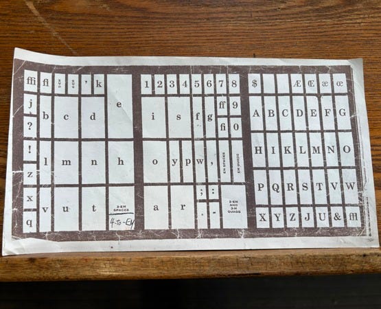
my cheatsheet for letter layout in the case
Letterpress printing is how all printing was done over a hundred years ago: each letter, each space made of lead, set one-by-one, backwards. We have a beautiful shop in my town called North Bay Letterpress. I am training there to learn to print the old-fashioned way, and am called to write some poems about the experience. Each case, or drawer in the cabinet, holds a complete alphabet of a particular point size. So, for the Times New Roman font for example, there are cases for each size, from six point to forty-eight point. Each case is so heavy I cannot lift it!

The case is designed so when you stand in front in the middle, the most-used letters are central and close at hand. Letters used less often are to the far right, far left, and top. You'll notice, at the top left and right corners, ligatures--more than one letter set together so the spacing is pleasing--functional ligatures on the left, aesthetic ligatures on the right.

letterpress - first day

learning case layout
hunting for letters,
the lead for spaces between
measured in picas, ems, or ens
reach right for a capital G
far left the ligature fl
feel for the nick
face it forward
in the composing stick
keeps letters right side up—
then slugs between lines
for the leading

required paper,
my case-layout
cheatsheet
carry it from cabinet
to cabinet—
one day my hands
will know, reach
into the correct divider
for y, j, or k


Sounds fascinating! Enjoy!
You reduced what appears to be a complicated process into a short, tightly crafted poem! Bravo! Sounds as though this will be a fun and tactile challenge... (When I first glimpsed the photo of your cheatsheet, I thought it was a component for a board game!)